A rundown on the insights from user-testing Splitoo.
This Saturday was our first round of user testing with the Splitoo product. It’s been a year in the work. From discussing ideas, looking at payments solutions and settling on a business model. We are now at the point of tweaking the initial MVP, which means doing some user testing. This is something we’re familiar with, but it’s the first time we’ve done it together as a team.
User testing means putting real users in front of the product and seeing their responses. And we had some pretty drastic and amazing responses to the design.
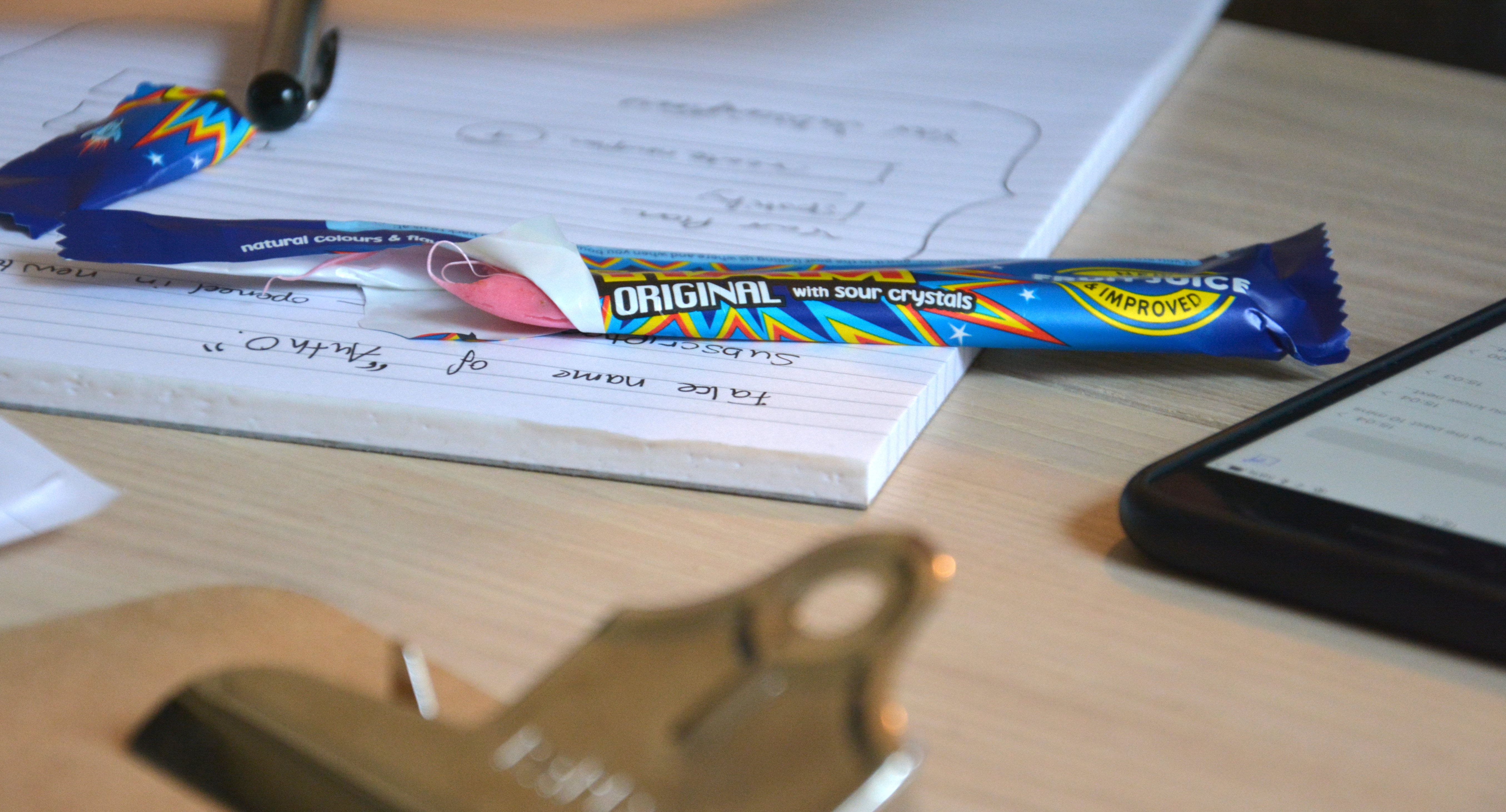
In the first round of testing after only a few users we found some big challenges. These challenges we’ll fix for the next iteration iteration of testing. User testing sessions are somewhere between agony and enlightenment. And of course, no user testing session is complete without the essential part of the process: Wham bars.
The Process
For the user testing we used a lightweight approach. Give a user a single task, in this case setting up a sharing plan and sending it to a family member. We completed the interviews with a single interviewer and remote. That means that the users would share their screen. The process felt very natural. It would be interesting to test if in-person user-testing has any significant advantages.
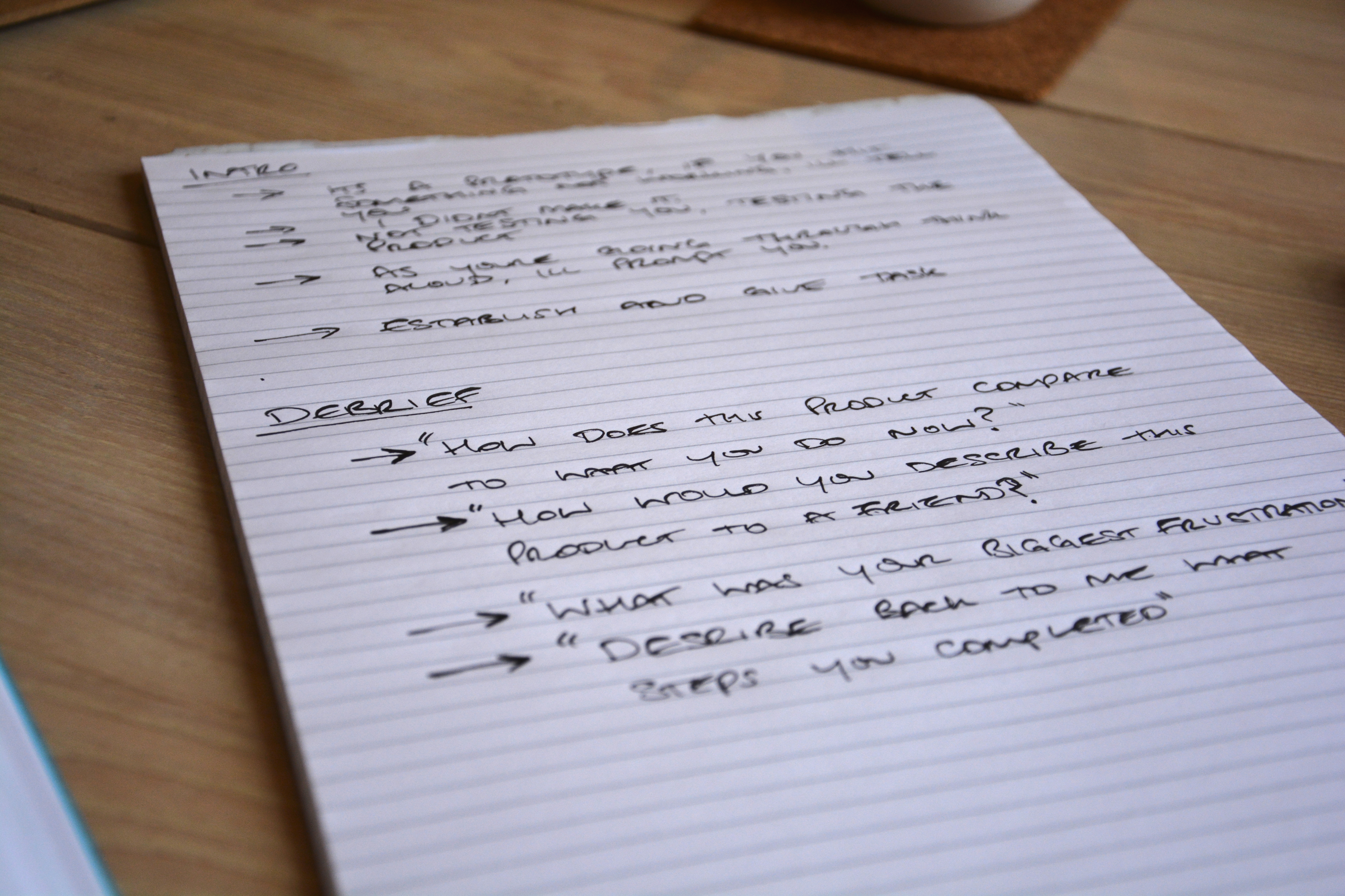
To help with the testing we created a set of notes, these included:Before the task:- Remind the participant that we’re testing the product, not them
Let the participant know that the interviewer
-
Remind the participant to talk through their steps
Introduce the task ** After the task debrief questions:**- How does this product compare to your current process?
What were your main frustrations with the product?
How would you describe the product to a friend?
Can you tell me what you just did?
From these questions we wanted to get main frustrations. But we also wanted to test the users use of language. Would the user adopt our terminology of “subscription” and “plan”. Or would they introduce us to new terminology that makes more sense.
The Current Product
		#gallery-1 {
			margin: auto;
		}
		#gallery-1. gallery-item {
			float: left;
			margin-top: 10px;
			text-align: center;
			width: 100%;
		}
		#gallery-1 img {
			border: 2px solid #cfcfcf;
		}
		#gallery-1. gallery-caption {
			margin-left: 0;
		}
		/* see gallery_shortcode() in wp-includes/media.php */
The home page
The login page
The dashboard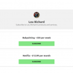
The subscription page
-
Part 1–** The beginning of the user journey starts with a form on the homepage. This allows the user to enter a name / description for their shared item, a cost per person and the schedule.
-
Part 2–** After clicking create, the user then logs in with Facebook or Google.
-
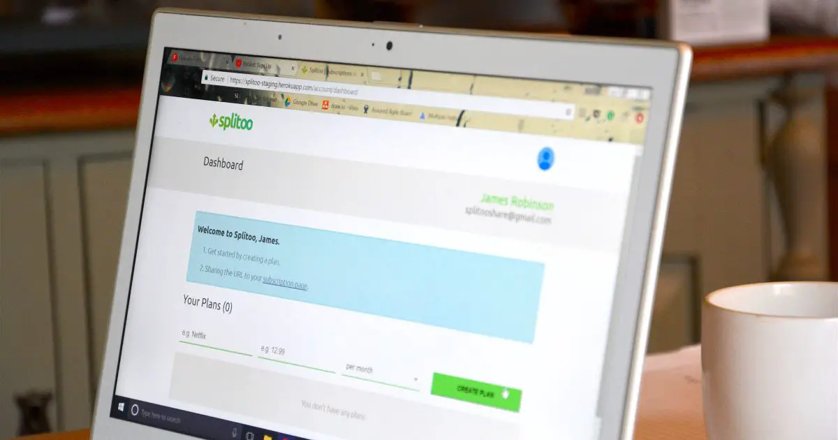
Part 3–** Now the user is redirected to their Dashboard, where their shareable plans can be seen. Above the plan is some instructions about how to share the URL to their “sharing page”. Also, from the dashboard they can create any number of new plans, or see their personal subscriptions.
The Biggest Findings
Positives Login / Sign up– We created a one click sign up process on purpose. It seems that this resonated with users, completing sign up with ease. If anything, the login / on-boarding journey could be too fast. ** Conceptual understanding**– All users seemed to understand the purpose of the product. All users also repeated back to us what the product was in a way that was inline with our vision.
Improvements ** Users prefer calls-to-actions over sharable links**– The shareable link was a massive blocker for users. They didn’t get the idea of having to copy a link from the URL. All users expressed the desire for some sort of share by email functionality. They were all also expecting a button in the same place on the plan tile. All the users pointed to the same 100×100 pixel area, expecting a specific button to be in that place. A fascinating amount of correlation between the different users. ** Social sharing is a touchy subject**– We’re using the provider Auth0 for login. When redirected to social a big scary “Your details are being shared with Auth0 would come up”. Whilst not a blocker, this startled users and could cause abandonments on the sign up journey. ** Info boxes aren’t as strong as calls-to-action**– We tried hard to have an info box worded well. But it seems that as users, we’re conditioned to look for calls-to-action. Most users were interacting with the create plan form. Which, considering they already had created a plan via the home page, wasn’t what we had in mind! We found that most users didn’t read the information box we put on screen. Testifying to the power of the subconscious.
Changes
Based on the findings we’re going to be changing up the design somewhat. We’ll be changing the whole sharing profile idea and instead going for a share by email approach.
The user testing sessions proved of incredible value and I’m sure they’ll become an ingrained way of working for the Splitoo team in the future. We’ll be back very soon with another update as we move towards launch in early 2018 – watch this space.
Have you performed user testing in the past? What was your experience?

Lou Bichard
Hey I'm Lou! I'm a Cloud Software Engineer. I created Open Up The Cloud to help people grow their careers in cloud. Find me on Twitter or LinkedIn.
See all posts →Latest posts by Lou Bichard (see all)
- 2024 Summary - A year of trips and professional work - January 9, 2025
- 2023 Summary - Data Driven Stories About The Cloud - December 31, 2023
- 2022 Summary - The Open Up The Cloud System - January 1, 2023